

When it comes to keeping up with the latest colour trends, Pantone is the expert authority on the next big thing. And although we’re only just gearing up for winter, the Pantone team has already declared what’s hot for next year.
According to the brand’s Spring 2016 report, Rose Quartz, Lilac Grey and Limpet Shell are three of the hues to embrace. So, if you like to stay one step ahead, here’s how to decorate your home with these pastel shades
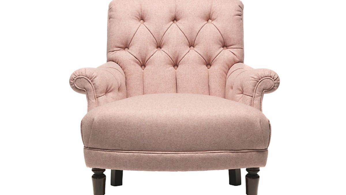
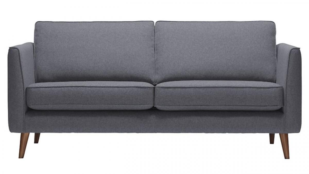
Rose Quartz
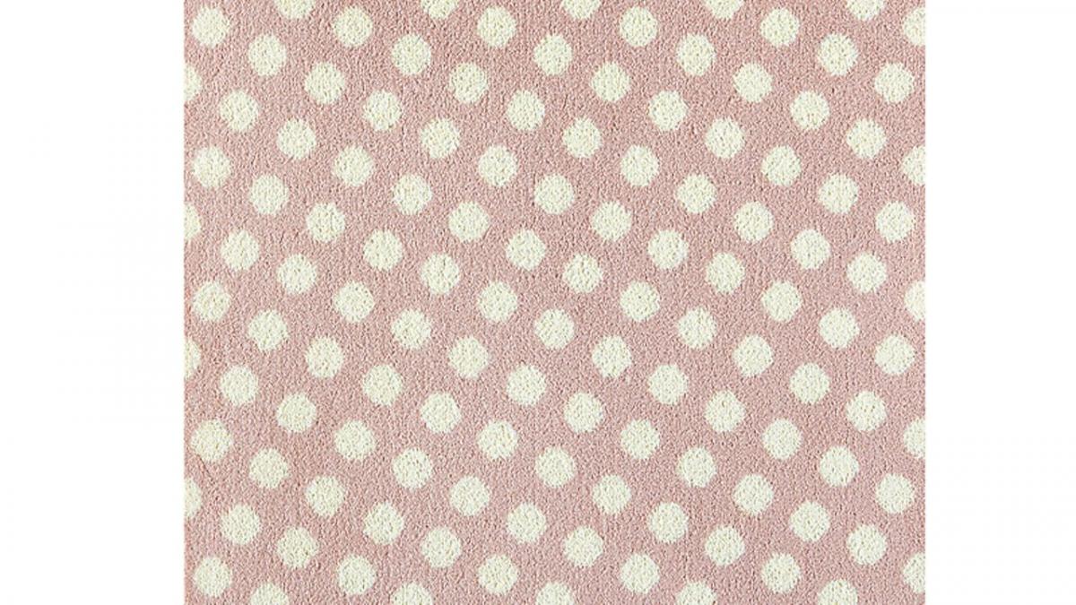
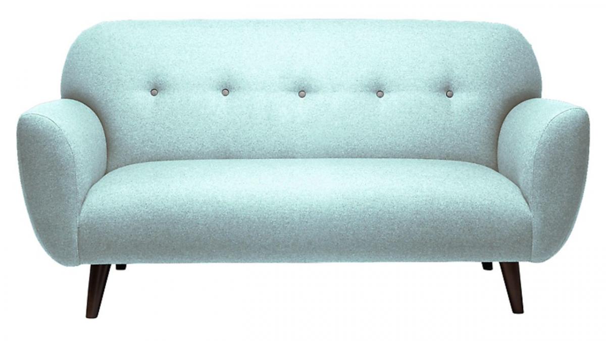
Leatrice Eiseman, executive director of the Pantone Color Institute, describes this muted pink as a ‘persuasive yet gentle tone that conveys compassion and a sense of composure.’ Choose a comfy armchair to make a statement with or experiment with a patterned carpet.
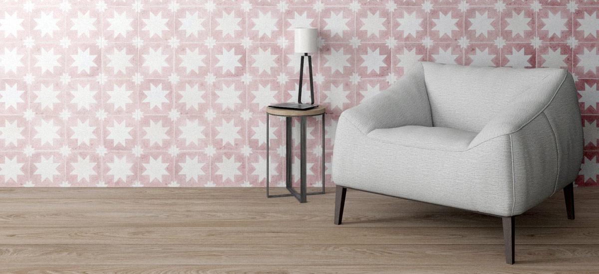
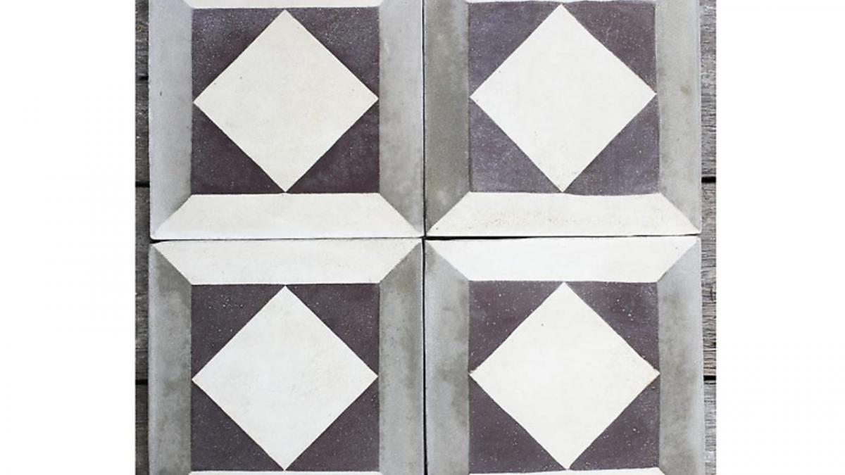
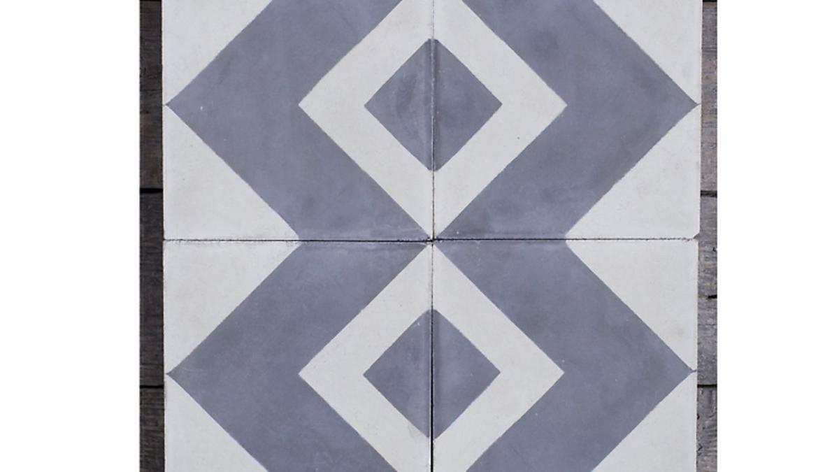
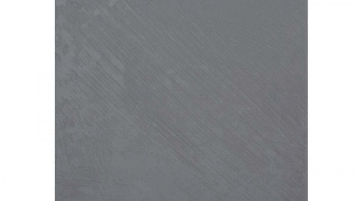
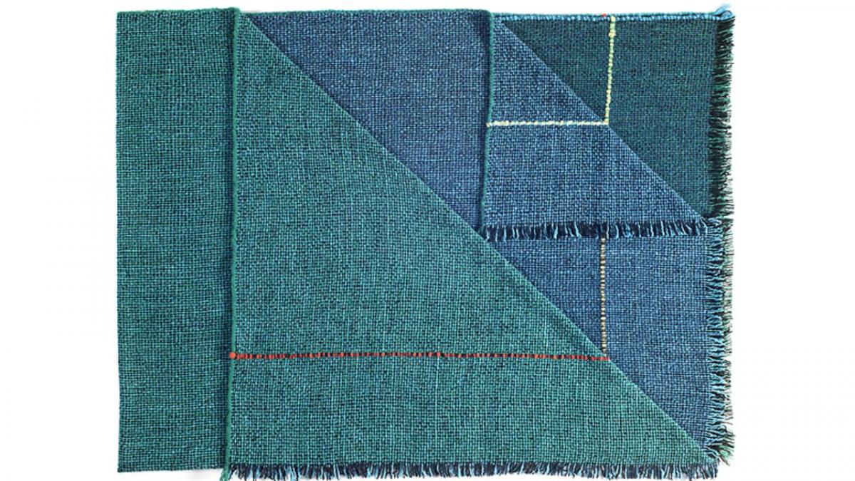
‘Essentially a basic, the subtlety of the lilac undertone in Lilac Grey, adds a distinctive edge to this classic grey shade,’ Eiseman says. Just more proof the trend for grey isn’t going anywhere – and this ‘basic’ doesn’t have to be boring. These Bert & May tiles are sure to stand out.
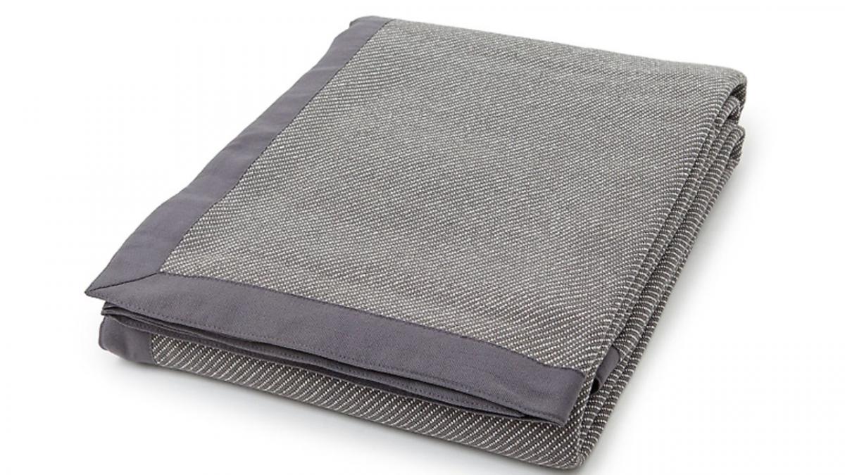
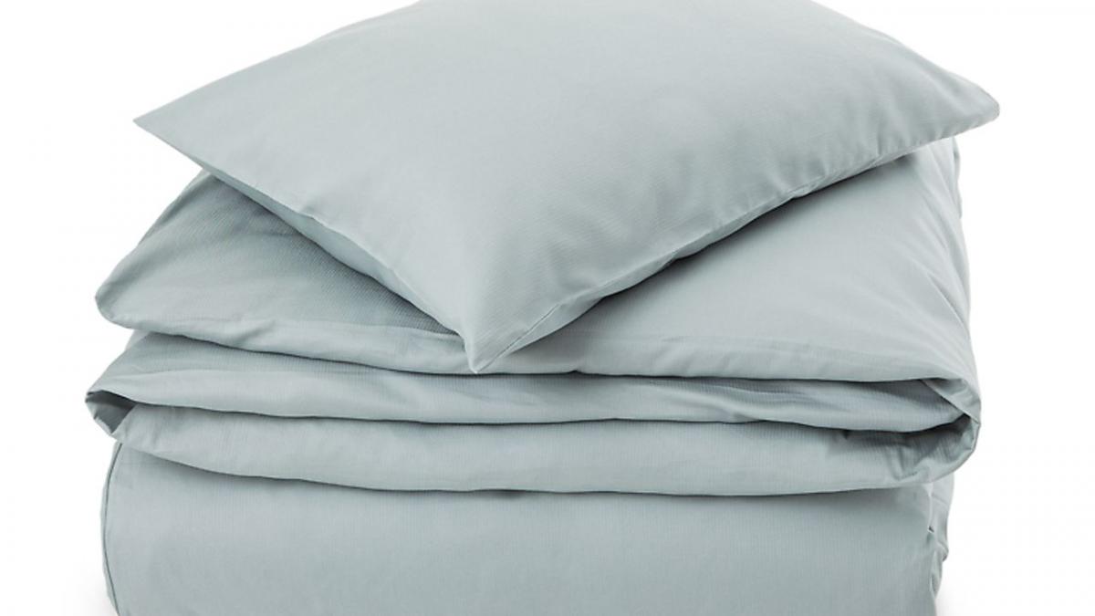
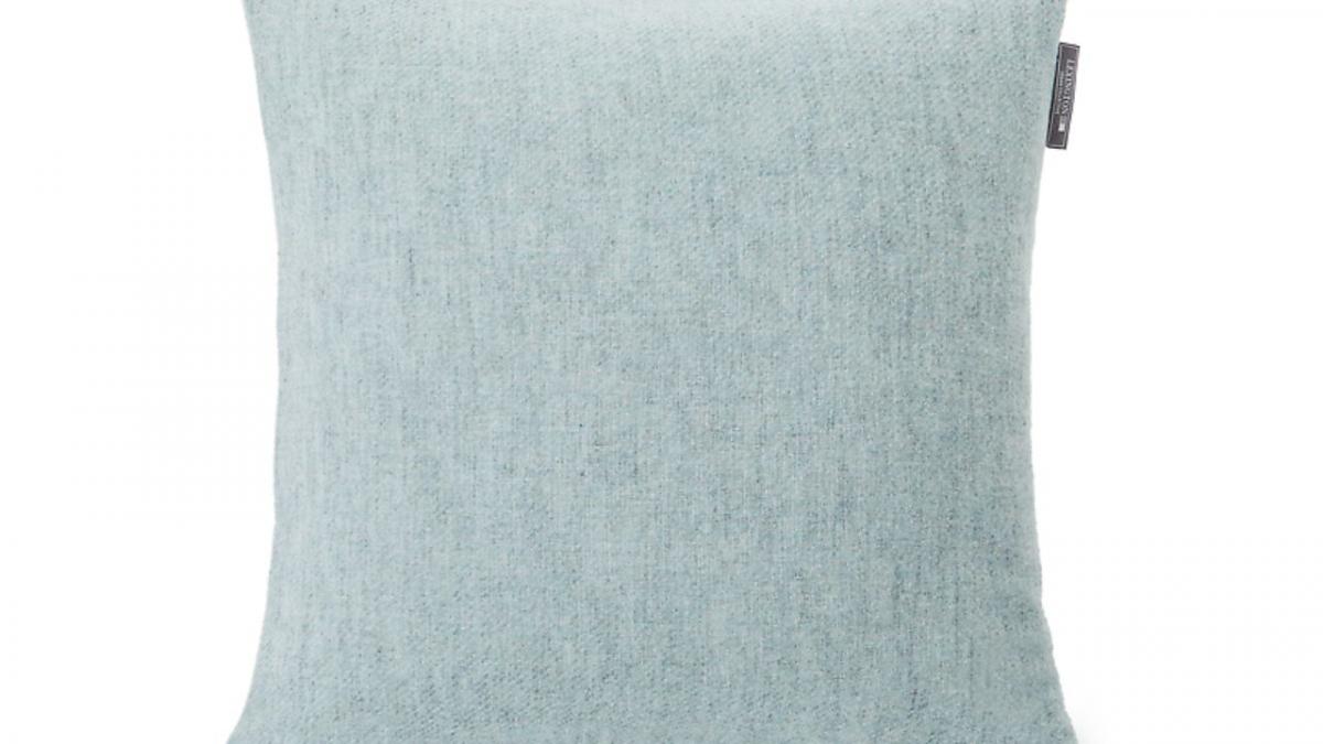
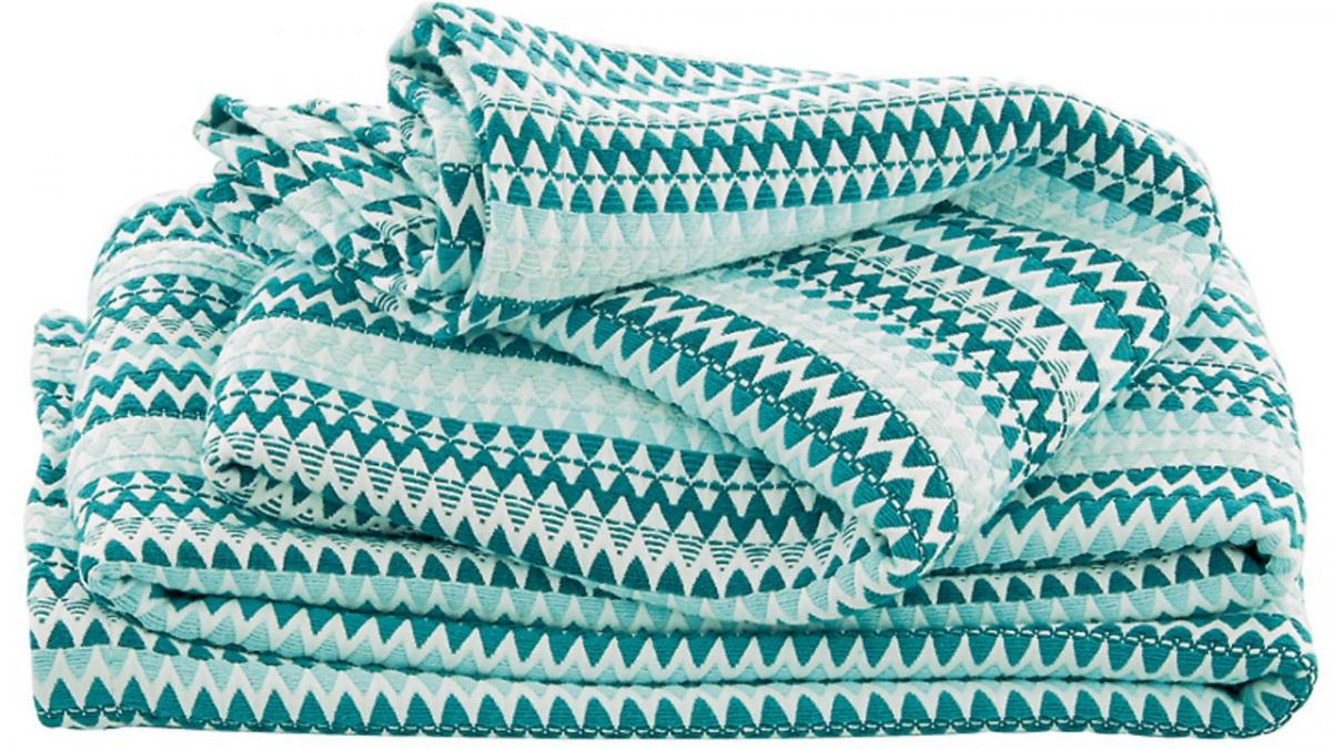
‘Suggestive of clarity and freshness, its crisp and modern influences evoke a deliberate, mindful tranquility,’ says Eiseman. There’s no better way to welcome the start of a new season than with a few cosy home accessories in a clean, cool colour. Keep this aqua tone on your radar next spring.
ABIGAIL AHERN ON HOW TO USE COLOUR IN HOMES


Comments: Our rules
We want our comments to be a lively and valuable part of our community - a place where readers can debate and engage with the most important local issues. The ability to comment on our stories is a privilege, not a right, however, and that privilege may be withdrawn if it is abused or misused.
Please report any comments that break our rules.
Read the rules here